The main properties of Flexbox with examples using HTML and CSS
Flexbox is a robust layout model in CSS that simplifies the process of creating flexible and responsive layouts. Here is a summary of the key properties of Flexbox with examples using HTML and CSS:

1. display: flex;
This property is applied to the container element and enables Flexbox layout for its children.<!DOCTYPE html>
<html>
<head>
<meta http-equiv=”X-UA-Compatible” content=”IE=edge”>
<title>Flex Box</title>
<meta charset=”UTF-8″>
<meta name=”viewport” content=”width=device-width, initial-scale=1″>
<meta name=”copyright” content=”© 2024–2025 Arshad Ali. All rights reserved.”>
<link rel=”profile” href=”https://gmpg.org/xfn/11″>
<link rel=”canonical” href=”https://arshadali.in/” />
<meta name=”language” content=”English”>
<meta name=”author” content=”Arshad Ali Website Developer”>
<meta name=”robots” content=”index, follow”>
<meta name=’robots’
content=’index, follow, max-image-preview:none, max-snippet:-1, max-video-preview:-1, noimageindex’ />
</head>
<body>
<div class=”flex-box-div”>
<div class=”container”>
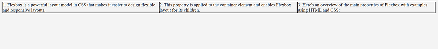
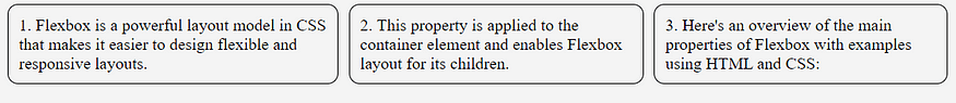
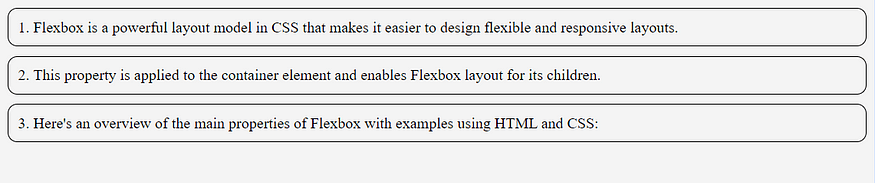
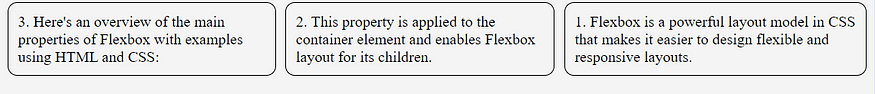
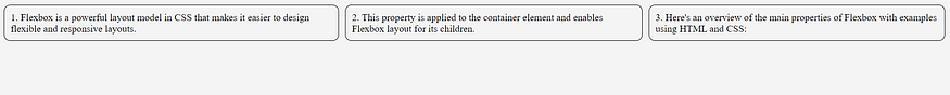
<div class=”item”>Flexbox is a powerful layout model in CSS that makes it easier to design flexible and
responsive layouts.</div>
<div class=”item”>This property is applied to the container element and enables Flexbox layout for its
children.</div>
<div class=”item”>Here’s an overview of the main properties of Flexbox with examples using HTML and CSS:
</div>
</div>
</div>
</body>
</html>

body{
background: #f4f4f4;
}
.container {
display: flex;
}
.item {
border: 1px solid #000;
}
2. Gap
A gap of 10px between the items using the gap property.
Example: In this example, any child elements of the .container will be displayed in a flex layout, and there will be a gap 10px between each child element. You can adjust the value of gap to increase or decrease the spacing between the items according to your design needs..container {
display: flex;
gap: 10px;
}
.item {
border: 1px solid #000;
border-radius: 10px;
padding: 10px;
}

3. flex-direction
Specifies the direction of the main axis (horizontal or vertical).
flex-direction: row|column|row-reverse|column-reverse|initial|inherit;
3.1 row: Default value. The flexible items are displayed horizontally, as a row.
.container {
display: flex;
gap: 10px;
flex-direction: row;
}
3.2 column: The flexible items are displayed vertically, as a column
.container {
display: flex;
gap: 10px;
flex-direction: column;
}
3.3 row-reverse: Same as row, but in reverse order
.container {
display: flex;
gap: 10px;
flex-direction: row-reverse;
}
3.4 column-reverse: Same as the column, but in reverse order

.container {
display: flex;
gap: 10px;
flex-direction: column-reverse;
}
4. justify-content
Aligns flex items along the main axis.
justify-content: flex-start|flex-end|center|space-between|space-around|space-evenly|initial|inherit;
flex-start: Default value. Items are positioned at the beginning of the container:
flex-endItems: are positioned at the end of the container
center: Items are positioned in the center of the container
space-between: items will have space between them
space-around: items will have space before, between, and after them
space-evenly: Items will have equal space around them
initial: sets this property to its default value.
inherits: Inherits this property from its parent element.
.container {
display: flex;
gap: 10px;
flex-direction: row;
justify-content: space-between;
}
5. align-items
Aligns flex items along the cross-axis.
align-items: normal|stretch|positional alignment|flex-start|flex-end|baseline|initial|inherit;
normal: Default. Behaves like ‘stretch’ for flexbox and grid items, or ‘start’ for grid items with a defined block size.
stretch: Items are stretched to fit the container
center: Items are positioned at the center of the container
flex-start: Items are positioned at the beginning of the container
flex-end: Items are positioned at the end of the container
start: Items are positioned at the beginning of their grid cells, in the block direction
end: Items are positioned at the end of their grid cells, in the block direction
baseline: Items are positioned at the baseline of the container
initial: Sets this property to its default value. Read about initial
inherit: Inherits this property from its parent element. Read about inherit
.container {
display: flex;
gap: 10px;
flex-direction: row;
justify-content: space-between;
align-items: center;
}
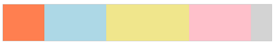
6. flex-grow
The flex-grow property specifies how much the item will grow relative to the rest of the flexible items inside the same container.
flex-grow: number|initial|inherit;
number: A number specifying how much the item will grow relative to the rest of the flexible items. The default value is 0
initial: Sets this property to its default value.
inherit: Inherits this property from its parent element.
<!DOCTYPE html>
<html>
<head>
<title>Flex Box</title>
</head>
<body>
<div id=”main”>
<div style=”background-color:coral;”></div>
<div style=”background-color:lightblue;”></div>
<div style=”background-color:khaki;”></div>
<div style=”background-color:pink;”></div>
<div style=”background-color:lightgrey;”></div>
</div>
</body>
</html>#main {
width: 100%;
height: 100px;
border: 1px solid #c3c3c3;
display: flex;
}
#main div:nth-of-type(1) {flex-grow: 2;}
#main div:nth-of-type(2) {flex-grow: 3;}
#main div:nth-of-type(3) {flex-grow: 4;}
#main div:nth-of-type(4) {flex-grow: 3;}
#main div:nth-of-type(5) {flex-grow: 1;}

February 20, 2024
How to use autopsy forensic tool

February 20, 2024